
.jpg?h=350&la=fr-FR&w=700&hash=2187702C364E9C4133CC59881B43A476FE3B18CE)
Brands invest a great deal of time and resources when selecting a new color to represent their products. If the color doesn't match expectations after printing, runs are wasted, and everyone is left wondering where the color went wrong. Here's a typical scenario. A brand selects a season color for product packaging and communicates that color to the designer. The designer integrates the color into the design and hands it off to the premedia team to convert it into print-ready files. The files a...
Posted September 13, 2024 by X-Rite Color

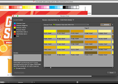
Originally published May 3, 2024 from https://canmaker.com/light-touch/ Industry stakeholders came together to explore ink and proofing standards for two-piece beverage cans. Nisa Ali reports from Manchester Leading companies across canmaking industry supply chains are considering general guidance for PantoneLIVE colours in the production of two-piece beverage cans. Following a series of seminars discussing the role of PantoneLIVE colour libraries in the design, proofing and printing process ...
Posted August 26, 2024 by X-Rite Color
Une modification récente de la directive européenne relative à la limitation de l’utilisation de certaines substances dangereuses dans les équipements électriques et électroniques annulera, d’ici le 24 février 2025, l’exemption actuelle concernant l’utilisation du mercure dans un certain nombre de types de lampes fluorescentes à des fins spécifiques. Ces ampoules sont définies dans la clause 2(b)(4)-I d...
Posted February 12, 2024 by X-Rite Color
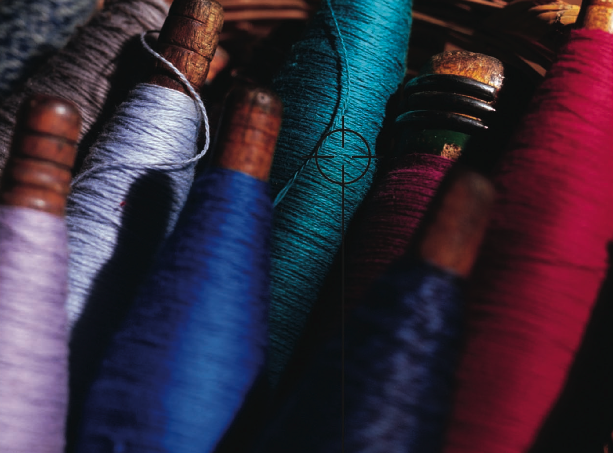
L’empreinte écologique de la mode est hors de contrôle. Selon le Conseil de défense des ressources naturelles (NRDC, Natural Resources Defense Council), "les usines textiles génèrent un cinquième de la pollution industrielle de l’eau dans le monde et utilisent 20 000 produits chimiques, dont beaucoup sont cancérigènes, pour fabriquer leurs vêtements". Teinture de tissu en usine. Image de NRDC.org. Un probl&egr...
Posted April 12, 2023 by X-Rite Color
If ensuring color consistency is part of your job description, you’ll want to learn more about PantoneLIVE. Our customers report that it helps them get products to market an average of four times faster! PantoneLIVE is an end-to-end, digital color communication ecosystem that helps everyone involved in a packaging workflow visualize and communicate color. It shows which colors are achievable, and which are not, across everything from flexible packaging to corrugated board. And, since the digital...
Posted March 15, 2023 by X-Rite Color
.jpeg?h=285&la=fr-FR&w=400&hash=B925BB4A14353A0D33D90380BF577C7DE32C563D)
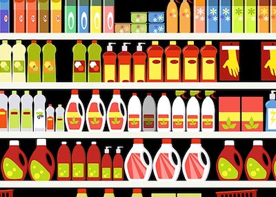
When all of final production packaging comes together on the store shelf, it’s a brand’s moment of truth. Do the stand-up pouches, overwraps, and corrugated POP displays match? How close is the color to its standard? We know you spend so much time and money designing, proofing, sampling, printing, and shipping… so where does the color go wrong? Is it an issue with accuracy, consistency, or both? Package designs come together on the shelf. Here you see pouches, labels, cartons, and corrugated wit...
Posted March 15, 2023 by Cindy Cooperman
Comment gérer plus de 2 000 couleurs de marque dans une chaîne d’approvisionnement mondiale complexe ? Les choses se compliquent ! Bien qu’il puisse sembler plus facile de créer une nouvelle couleur plutôt que de fouiller dans des bases de données ou des classeurs de drawdowns pour trouver la correspondance la plus proche, le problème survient plus tard, lorsque vous êtes confronté à une immense bibliothèque, impossi...
Posted March 15, 2023 by Cindy Cooperman
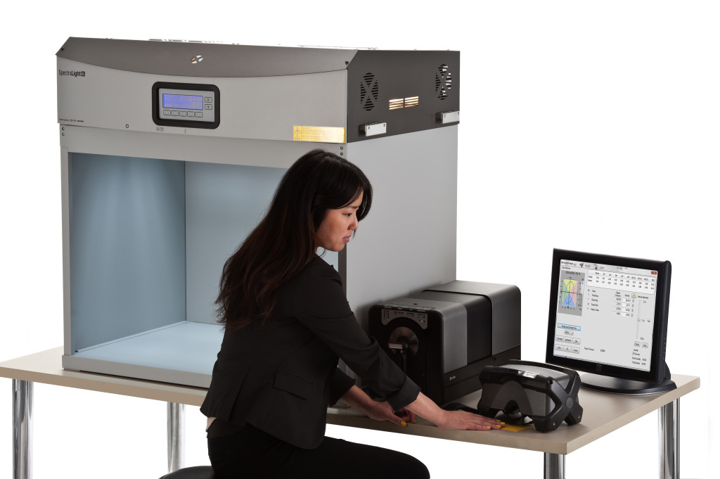
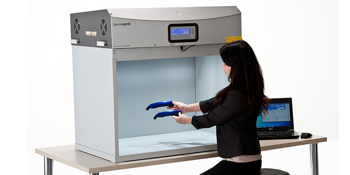
Does your quality control program include visual evaluation? If not, it should. Using the SpectraLight QC as part of a color evaluation workflow. No matter your industry, judging color is more than just measuring samples with a color measurement device. Just because a spectrophotometer says your color is within tolerance, doesn’t necessarily mean it will look right to the human eye. To minimize customer rejects, your color control process needs to include visual evaluation in a light boo...
Posted March 15, 2023 by X-Rite Color
Comme pour vous, la numérisation et la durabilité sont au cœur de nos préoccupations. Cependant, la couleur est souvent négligée lorsqu’il s’agit de développer des produits textiles. La numérisation de la chaîne d’approvisionnement textile et l’application de la gestion des couleurs à chaque étape seront finalement rentabilisées grâce à des couleurs plus précises, une pro...
Posted March 13, 2023 by X-Rite Color
.jpg?h=285&la=fr-FR&w=400&hash=838AE420B0D6AB7AA2255986C94C83BD74E7DD77)
Que vous deviez choisir des couleurs pour une enseigne, créer des palettes chromatiques pour une nouvelle gamme de produits ou concevoir un emballage éphémère, l’inspiration est une étape clé dans l’approche de sélection. L’inspiration peut surgir des situations du quotidien, par exemple : En soirée. Au supermarché. Lors d’une rencontre sportive. Et bien sûr, en plein air. La nature a le don de cré...
Posted November 04, 2022 by X-Rite Color
